Brand guide
What this site is made of, and the rules it follows. Written down mostly so that anything added later matches, and partly because a guide that publishes its data ought to publish its design too.
The idea
It is a field guide, so it should look like one: a reference book rather than a campaign. That decides almost everything else. Editorial typography, hairline rules, generous white space, and photographs given room. No cards, no drop shadows, no gradients, no rounded boxes inside rounded boxes.
The test for any new element is whether it would look at home in a well-set reference book. If it would only look at home on a marketing site, it comes out.
Name and wordmark
The name is Milkweed USA. It sets as MilkweedUSA with the two halves separated by a hairline: Milkweed in the serif at normal weight, USA in the sans, small, letterspaced, in orange.
- Never MilkweedUSA, Milkweed U.S.A. or milkweedusa in running text.
- The wordmark is type, not a logo file. It can be set anywhere the fonts are available.
- The icon is a geometric M with an amber underline, in SVG. It exists for a browser tab and a home screen, not as a badge to put on things.

Color
One green, one orange, and paper. Everything else is a tint of those or a neutral. The palette is defined once in public/styles.css and read from there to build this page, so these values are the real ones.
Core
Paper and ink
Supporting
Rules. Orange is an accent and never a background for a large area. Green carries structure. Every one of these has a dark-mode counterpart in the same stylesheet, so nothing should be hard-coded in a component: use the variable.
Typography
No web fonts, on purpose. The site loads no third-party resources at all, and system fonts render instantly on any connection. The stacks are picked so the result looks deliberate on every platform rather than falling back to something ugly.
- Serif
ui-serif, "Iowan Old Style", "Palatino Linotype", Palatino, Georgia, "Times New Roman", serif- Sans
-apple-system, BlinkMacSystemFont, "Segoe UI", Roboto, "Helvetica Neue", Arial, sans-serif- Mono
ui-monospace, SFMono-Regular, "SF Mono", Menlo, Consolas, monospace
- Serif for reading. Headings, body copy, ledes, anything of length.
- Sans for scanning. Navigation, labels, table headers, metadata, small capitals.
- Mono for machines. Code, DOIs, endpoint paths.
- Body text sits at a
70chmeasure. Longer lines are harder to read, not more efficient. - Section labels are sans, uppercase, letterspaced, small, above a rule. That pattern appears on the site, in the PDFs and on the social cards.
Layout
- Content sits in a
1180pxcontainer with a1.25remgutter. - Sections alternate between paper and paper-alt to give rhythm without boxes.
- Hairline rules separate things. Borders and shadows do not.
- A grid column that can hold wide content gets
minmax(0, 1fr), never a bare1fr. A bare1frismin-width: auto, and one wide table then makes the whole page scroll sideways. - Anything wider than its column scrolls inside its own container. The page itself never scrolls horizontally at any width.
Photography
- Every photograph is freely licensed: public domain, CC0, CC BY or CC BY-SA. Nothing else is used, ever.
- Every photograph is self-hosted. Nothing is hotlinked, so nothing breaks when somebody reorganizes their server.
- Every photograph is credited in place with the photographer, the license and a link to the source. This is a license condition, not a courtesy.
- Alt text describes what is in the frame. A file name is not alt text.
- The homepage photograph is monarchs or milkweed, landscape, and nothing else. Both rules are enforced in code rather than by habit.
Assets
- icon.svg, the M monogram, scalable.
- apple-touch-icon.png, 180 by 180.
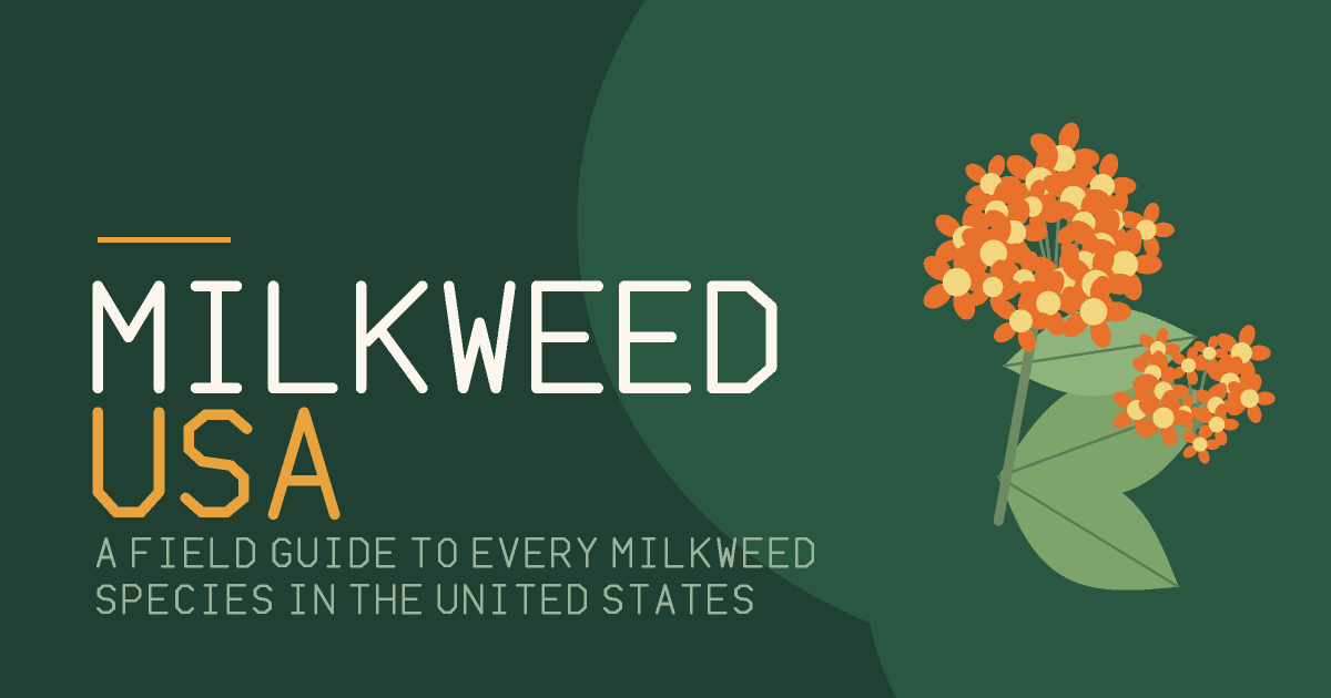
- social-card.png, the generic 1200 by 630 card. Every page also has its own, generated with its own photograph.
- styles.css, the whole design system in one file, with every token at the top. The filename carries a content hash, so it is safe to cache forever.

Using any of this
The text and data are CC BY 4.0 and you are welcome to them. The name and the wordmark are a different matter: please do not use them in a way that suggests this site produced or endorsed something it did not. Credit with a link is what is wanted, not a logo on your product.
Cite this page
This page is licensed CC BY 4.0. Quote it, adapt it and reuse it, including commercially, as long as you credit Milkweed USA and link back.
Milkweed USA. (2026). Brand guide. Retrieved DATE, from https://milkweedusa.com/brand/
"Brand guide." Milkweed USA, 2026, https://milkweedusa.com/brand/. Accessed DATE.
Milkweed USA. "Brand guide." Last modified 2026-08-01. Accessed DATE. https://milkweedusa.com/brand/.
@misc{milkweedusa_brand,
  title  = {Brand guide},
  author = {{Milkweed USA}},
  year   = {2026},
  url    = {https://milkweedusa.com/brand/},
  note   = {Accessed DATE}
}